My book is titled Juxtaposed, and juxtaposed is defined as "elements placed side by side, leaving it up to the viewer to establish connections and impose a meaning. By digitally manipulating different images together, I hope to make the view think about the images and draw their own conclusions. My intention in this series was to mix things that do not necessarily go together, for a digitally manipulated end product that fits together well.
My images focus on the shape, detail and texture of multiple objects. In many of my images, I hid certain parts of each image and highlighted other parts so that the most interesting texture and detail stands out in the final image.


In most cases I think you were successful at synthesizing distinct elements into a believable whole. The color in the third- and second-to-last images is really attractive, but I think it is a tool you could have used more successfully in other images either to emphasize or neutralize the discrete qualities of the composed images.
ReplyDeleteHey Zoe!
ReplyDeleteI think your pictures display great use of photoshop. All of them have vibrant colors that makes your collection very intriguing. I also think your title really describes what you were going for in this project.
Great Job!
Zoe,
ReplyDeleteYour digital manipulations were very interesting and intriguing. The most appealing picture was the red and orange sky with the mountain. I thought it was the best manipulation that you had but as a whole the series went together really well.
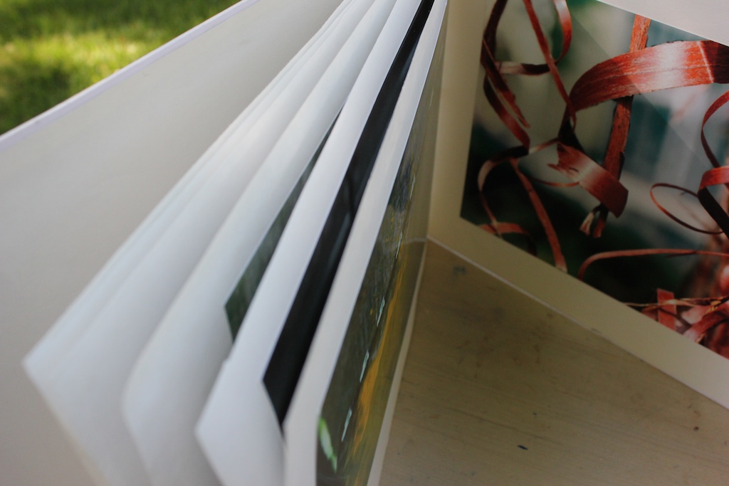
I really liked your cover with the crossword puzzle. The page with the definition of juxtaposed was a really cool idea and it added a nice element to the book. I thought the colors were the best part of the book.
ReplyDeleteZoe, very nice work. Clearly your Photoshop skills are impeccable. You have used your skills to create some very compelling photos. Also, good choice for mounting on white paper, black would have been visually difficult to decipher.
ReplyDeleteZoe I am in love with your photographs and have so many favorites. Another great aspect of your book is the definition of juxtapose, though some may call cliche, I like it :) Also, your photographs work well together in a series and it is absolutely lovely. Excellent!
ReplyDeleteZoe,
ReplyDeleteI admire your skills in photoshop! All of your photos are very creative and interesting making for a very successful series. I really liked the definition of the juxtaposition definition because I think it really spoke to all of your photos. I love your book!! nicely done.
The significant use of translucent layers and bright colors is so intriguing!. The top layers are more solid and thus the colors pop more, but as you get into the layers beneath the opacity goes down, and I think that generates a really interesting effect of a spectrum from solid to see-through. Nice job!
ReplyDeleteI love your use of translucent layers to create interesting textures in your images. Also, your photographs work very well as a collection and came together beautifully in your book. Also, how you compose and edit your images is extremely creative! Nice work!
ReplyDelete